This post is part of the series Housing Affordability 1971-2009
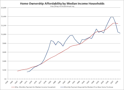
I have updated some of the charts from the previous posts and put them in one post for easier access. For explanations on the data and commentary, please follow the links to the source posts. Click "read more" to see all updates.
From Interest Rates and Borrowing Capacity:
From Two Ways of Looking at It:
From Long Term Trends:
From Payments, Prices and Capacity:
I am making the spreadsheet available to save others the pain of having to copy values from PDF files into a spreadsheet. I do not mind if you create derivative works with any of the charts, but I do ask that you give me a mention. A simple "Credit to Morally Bankrupt for data in spreadsheet format" with a link to this post so others can download the source spreadsheet would be sufficient.
Download the spreadsheet in Microsoft Excel format.


I have refreshed a portion of the outlines from the past posts and put them in one post for more straightforward access. For clarifications on the information and analysis, kindly follow the connections to the source posts. Click "read more" to see all updates.
ReplyDelete