This post is part of the series Housing Affordability 1971-2009
I have collected all of the charts from the previous posts in the series and put them in one post for easier access. For explanations on the data and commentary, please follow the links to the source posts.
From Interest Rates and Borrowing Capacity:
From Two Ways of Looking at It:
From Long Term Trends:
From Payments, Prices and Capacity:
I am making the spreadsheet available to save others the pain of having to copy values from PDF files into a spreadsheet. I do not mind if you create derivative works with any of the charts, but I do ask that you give me a mention. A simple "Credit to Morally Bankrupt for data in spreadsheet format" with a link to this post so others can download the source spreadsheet would be sufficient.
Download the spreadsheet in Microsoft Excel format.


Nice charts!
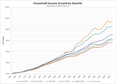
ReplyDeleteI thought the Household Income Growth by Quintile chart was interesting -- but it might be more informative if it were set against 1980 or 1990, rather than 1967
Also, the top 1% is wildly disparate -- if you can break that down, you'd be surprised at what it looks like
Let me know what you come up -- shoot over any changes you make to these
A valueable information about the Housing Affordability. The graph also show the all details about the Housing Affordability, and it's easy to understand. The graph also provides the knowledge about the Purchasing Power of a $100 Monthly Mortgage Payment, Household Income Growth by Tranexamic Technologies, Median-Price New Home Payment as a % of Median Household Income, Growth in Home Prices and Income, Change in Price or Payment of a New Home and Rent of Primary Residence, Median New Home Prices and Purchase Capacity, Home Ownweship Affordability by Median Income Households and Growth in Median Household Income, Home Prices and Buying Capacity.
ReplyDelete